Introduction: The Power of Crafting Effective Calls-to-Action (CTAs)
Calls to action are often overlooked, which is surprising considering they’re the part that actually drives results. In digital marketing, CTAs are among the most crucial tools for driving conversions, shaping user behavior, and converting ad spend into tangible results.
You can have the cleanest landing page, the most polished email, the smartest ad strategy, but if your CTA flops, none of it matters. This is what turns a browser into a lead, a click into a sale. It’s not about being clever. It’s about being clear, fast, and impossible to ignore.
In digital marketing, high-performing CTAs are often the difference between wasted traffic and real campaign ROI.
You’ve to understand how people think, such as where their attention goes and what kind of phrasing gets through when they’re skimming or half-distracted. For example, a CTA buried at the bottom of a lengthy page is often overlooked. The same applies to content that sounds too soft or generic. You want real words. Stuff that feels like it was written by a human who understands why someone’s even on that page to Make Your Calls to Action Stand Out.
Marketers who understand conversion behavior and align CTA intent with funnel stage see better performance across all channels. Good CTAs are built, not guessed. That’s how you start seeing real traction across your marketing channels, whether it’s email marketing, paid campaigns, social ads, or search engine marketing. When you dial this in, you stop wasting clicks and start pulling in conversions that actually lead somewhere.
Now let’s get started!
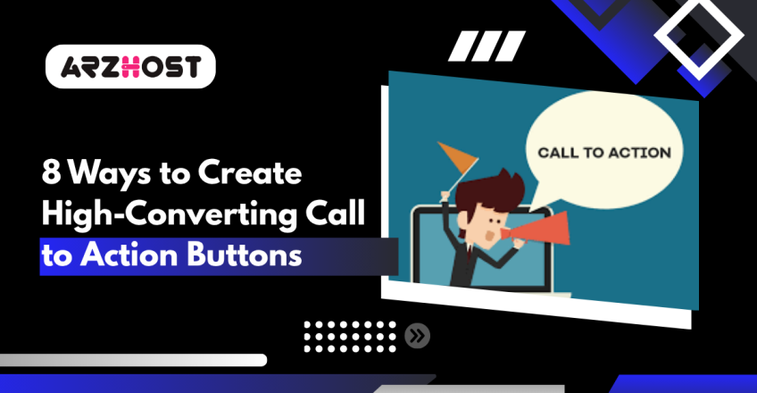
What is a Call to Action (CTA): Understanding the Power They Hold
A call to action, or CTA, is what turns passive interest into measurable results. It gives users a clear next step, whether that’s signing up, making a purchase, or getting in touch. Every campaign needs one. Without it, even the most compelling content or well-designed page can fall flat. The CTA is what connects your marketing effort to a specific outcome.
CTAs show up everywhere. It could be a big button on a product page, a line at the end of a newsletter, or a swipe-up in a social media campaign. The words you choose matter. So does the timing. A vague “learn more” won’t cut it if someone’s ready to buy. But if they’re just browsing, pushing too hard, too fast kills the mood. That’s why smart marketers examine where the user is in the funnel and adjust accordingly. No guesswork. Just context.
Design plays into this, too. If your CTA blends in, it might as well not be there. Contrast helps. So does placement. And if you’re using personalization features like name fields or dynamic offers based on behavior, you’ve got a better chance of pulling clicks. For example, dropping a limited-time offer right after someone browses a product page makes sense. It feels relevant. That’s the kind of stuff that works.
CTAs aren’t just fluff at the end of your content. They’re the part that decides if your campaign brings in leads, sales, whatever your goal is, or if it just looks good with no real payoff.
One Payment for a Lifetime of Hosting
Lifetime Hosting at a Fraction of the Price—Save 59% Today.
Start By Clicking HerePut Your CTA Where No One Can Ignore It
Making a call to action stand out begins with its visual appeal and placement on the page. Design shouldn’t only look good but also guide the user’s behavior. That’s why digital marketers lean heavily on visual hierarchy and smart UX design to ensure CTAs don’t get lost in the noise.
Placement is one of the biggest factors. If the CTA appears too low or gets buried in content, most people won’t even notice it. That’s why buttons placed above the fold still perform well, especially on landing pages where time-on-page is short. But context matters. If someone just read through a product walkthrough or blog post, that’s the moment they’re most ready to act. Dropping the CTA there catches that momentum.
Size and contrast also play a role. If the button’s too small, people miss it. Too big, and it looks pushy. The trick is getting the scale right and using color to create separation from everything around it. High-contrast colors naturally grab attention, especially when surrounded by enough whitespace to breathe. It’s the same principle used in ad design, like using contrast and space to guide the eye without cluttering the layout.
You’ll see this everywhere in conversion-focused design. E-commerce brands use bold CTAs against clean, minimal layouts. SaaS landing pages often break alignment, disrupting the visual flow and drawing attention to the signup form. They’re the result of constant testing and not guesses.
Marketers rely on A/B testing and heatmaps to fine-tune all this. The button’s color, shape, position, and even the padding around it are all thoroughly tested. And small tweaks often lead to big lifts in click-through rates. This kind of iterative optimization is a core part of conversion rate strategy. It’s about knowing what gets results.
Use Strong, Action-Oriented Verbs
If you want people to click, use words that encourage them to take action, use the best ways to advertise your website. Strong verbs get that job done. They’re clear, fast, and focused on action. Think “Download,” “Subscribe,” “Get Started,” “Join,” “Buy Now.” These aren’t just louder, they remove hesitation. They make the next step obvious.
The right verb depends on what you’re offering and who you’re talking to. An e-commerce brand needs different phrasing than a nonprofit. A B2B SaaS platform? Different again. For example, “Start Free Trial” works better for software because it removes risk. “Donate Now” hits harder for a nonprofit because it feels urgent and emotional. They’re based on behavior.
| Industry | Examples of Strong Action Verbs |
| E-commerce | Buy now, Add to Cart, Shop Today, Claim Offer |
| SaaS | Start Free Trial, Upgrade, Get Started |
| Nonprofits | Donate Now, Join Us, Support, Take Action |
| Content & Media | Subscribe, Download, Read More, Watch |
| Events | Register, Book Your Spot, Reserve Now |
That’s why top marketers test verbs constantly. It’s not just about picking what sounds good. They’re evaluating how each version performs in real-time. Small changes, such as switching “Learn More” to “Get Details,” can actually make a significant impact on click-through rates. And the difference isn’t theoretical. Real-world campaigns have demonstrated lifts of up to 10 to 15 percent solely from changes in verb usage.
What works best will always depend on your audience, your product, and the moment they’re seeing the CTA. That’s where segmentation comes in. You might use one CTA for cold traffic and a completely different one for returning visitors. Personalizing the verb based on intent takes your conversion rate optimization a lot further.
Action verbs are part of a larger data-driven marketing strategy that focuses on making campaigns perform better with fewer wasted impressions. Every word in a CTA carries weight, especially the first one.
Keep Your Message Clear and Specific
Clarity makes or breaks a CTA. If the message isn’t laser-focused, people will scroll right past it. Each button or prompt should trigger a single action; no stacking, no vague suggestions. Asking someone to “Download Now and Sign Up for Updates” in the same breath? That’s how you lose clicks.
Specificity adds power. When users know exactly what happens after they click, they feel more confident in acting. For example, “Start your free trial today” clearly states what they’ll receive and when. A bland “Learn More” doesn’t do that; it is too open-ended, and that gap creates hesitation.
You’re not just writing a button. You’re shaping user behavior. That starts with being intentional:
- Focus on one goal. Whether it’s a download, a signup, or a purchase, lock into a single outcome.
- Be direct about value. Let users know what they gain: free access, early entry, a discount.
- Avoid jargon. No one clicks on something they don’t understand.
- Add urgency if it makes sense. “Now,” “Today,” and “Instantly” all convey a sense of urgency and prompt action.
- Keep it short but not empty. Aim for impact, not just brevity.
- Test what works. Use A/B tools to see which version your audience actually responds to.
CTAs should be concise yet packed with meaning. A phrase like “Download the Guide” or “Claim Offer Now” gives direction and value. If you need more context, use supporting text nearby, not on the button itself. That keeps your design clean and your message sharp.
Tell People What Happens Next
People don’t click if they’re unsure what’s coming. That pause, that tiny second of hesitation, kills conversions. If your CTA is vague, like “Click Here” or “Learn More,” you’re forcing users to guess what’s behind the button. Most won’t bother.
The fix? Just be clear. Spell it out: “Download the guide instantly”, “Book your free call now”. Those kinds of phrases give direction and a payoff. They inform people about what they can expect and when. That eliminates friction and makes clicking feel like a natural, intuitive move.
Uncertainty creates resistance. And the more decisions someone has to make on the spot, the more likely they are to bounce. That’s just how the brain works; it tends to avoid effort. So when the CTA tells them exactly what’s on the other side, it feels easier, safer, and more worth it.
There’s also a reward loop in effect. You promise something immediate, then deliver it fast. That trains people to trust your buttons. They start clicking more often because, well, it worked last time. That pattern matters. It builds confidence in your site, your offer, and your whole funnel.
Bottom line: don’t make users wonder. Describe the action, outline the benefits, and convey a sense of urgency. It doesn’t matter if it’s an e-book, a discount, a meeting, or a free trial; just make it obvious. That’s how you stop drop-offs and get more people actually following through.
Create Real Urgency or Scarcity
If people think they might miss something, they act faster. That’s where urgency and scarcity come in. These aren’t marketing buzzwords, they’re emotional triggers. They capitalize on the Fear of Missing Out (FOMO), and that fear motivates people to click. It makes them buy. It shuts down hesitation.
Urgency is all about time. Say “the offer ends at midnight”, and people who were stalling suddenly move. Scarcity is about quantity: “only a few left”, “limited stock”, “almost sold out.” Both flip a switch in the brain that says, “decide now or lose it.” That’s loss aversion. And it’s stronger than the desire to gain.
Here’s what that looks like in real life:
- Limited time offer
- Only 3 left in stock
- Sale ends today
- Offer expires in 2 hours
These lines work because they’re clear. There’s no guessing. You either act or you don’t, but if you wait, it’s gone. That’s what gets results. In fact, campaign data shows that CTAs using urgency or scarcity can boost conversion rates by 30% or more. Not always, not everywhere, but when it fits the context, the lift is real.
But (and this matters) don’t fake it. If your timer resets every time someone visits the page, they’ll catch on. If you say “Only 2 left” and it’s 2 forever, you’re killing trust. People aren’t stupid. You can’t build long-term retention off tricks.
Use urgency when it’s true. Use scarcity when it’s honest. Combine that with clean design and direct copy, and you’ve got a CTA that pushes action without crossing a line. This isn’t hype. It’s just smart marketing that respects the user and gets results.
Use First-Person Voice to Make CTAs Personal
Here’s something that works way better than it looks. If your CTA says “Start your free trial,” try switching it to “Start my free trial.” One word, totally different reaction. The second version feels like something the user has already decided to do. It hits differently because it feels like their action, not yours.
This isn’t just a copywriting trick. There’s actual behavioral science behind it. First-person phrasing taps into how our brains react to self-reference. When people see words like “my” or “I,” their attention sharpens. It feels more relevant, more direct, less like an ad. That tiny psychological nudge? It’s enough to bump conversion rates.
There’s data on this, too. A SaaS company ran an A/B test with “Start my free trial” versus “Start your free trial” and saw a 14% lift in signups. Not a headline change. Just that one word. It stuck because it made the offer feel owned, like something personal.
Here’s how to flip it:
- Take your default CTA. “Subscribe to your newsletter.”
- Turn it into something like “Subscribe to my newsletter.”
- Keep the verb strong. “Download my guide.” “Claim my offer.”
- Check that it reads clean, then test it live.
This kind of tweak doesn’t take long, but it adds up fast, especially when you’re optimizing CTAs across emails, product pages, and paid ads. A good copywriting strategy is about knowing what shifts behavior. This one does.

Design with Creativity and Make Your Calls to Action Stand Out
If your CTA sounds like it could come from any brand on the internet, that’s a problem. CTAs should reflect your tone, your energy, and your voice. Otherwise, they’re just noise. When a button says something like “Let’s go” instead of “Submit form”, it catches people off guard, in a good way. It feels alive and real.
That’s what good branding does. It connects. And when your CTA sounds like the rest of your brand, the whole thing clicks. Email, ad, landing page; it should all feel consistent. That builds trust. People recognize it. They start associating that voice with results. And trust converts.
The same goes for design. Don’t just settle for a flat blue rectangle because that’s what your CMS gave you. Play with it, add movement, a hover effect, or a cheeky little icon. Perhaps the button shape slightly disrupts the grid, or maybe the color just pops enough to catch the eye. Tiny things, but they work.
Marketers doing this right aren’t guessing. They’re running creative tests. Swapping out CTA copy. Trying different tones, such as funny, bold, or warm, to fit the campaign. Testing shape, color, and motion. And yeah, looking at the data to see what version actually drives engagement. That’s how high-converting CTA design happens.
Creative CTA design is part of your overall conversion strategy, not a last-minute decision. So write like your brand talks. Design like your brand moves. When both line up, your CTAs stop fading into the page and start pulling people in. That’s how you get clicks that actually mean something.
Related Article: Content Marketing Strategy: Grow Your Business
Position CTAs Thoughtfully Throughout the Marketing Funnel
Here’s the part people often mess up: they use the same CTA for every visitor, regardless of where that person is in the funnel. Doesn’t work. Someone just learning about you doesn’t need a “Buy Now” button. That’s like proposing on the first date. If your CTAs don’t align with user intent, you’ll lose the click and potentially the entire lead.
At the top of the funnel, your goal is to educate and spark interest in your product or service. CTAs should be light and low-commitment, such as “Learn More,” “Explore the Platform,” or “Download the Guide.” You’re introducing the brand, building recognition, and earning trust. If you push too hard here, people bounce.
The middle of the funnel is comparison territory. This is where people weigh options, dig into features, and look for proof. So your CTAs need to shift. Think “See It in Action,” “Read the Case Study,” “Compare Plans.” This is the trust-building stage. You’re not selling directly—you’re helping them get confident.
By the time someone’s at the bottom, they’re primed. They’ve read the site, seen the demo, maybe even chatted with sales. Now you give them one clear path: “Start Free Trial,” “Buy Now,” “Get Started.” No overthinking. Just a clean step forward.
Aligning CTA copy with funnel stage, audience behavior, and conversion strategy makes your entire marketing flow sharper, more intuitive, and more effective. It’s basic user psychology, and it’s one of the fastest ways to improve campaign performance without requiring a complete rewrite.
Next-Gen Hosting Starts Here
Join thousands who trust ARZ Host for blazing speed and unbeatable uptime.
Click HereConclusion
If you want CTAs that convert, you can’t simply add a button to the page and hope for the best. Every small choice matters, from the wording and placement to the timing and even the color. And when all those choices actually reflect how people think, how they browse, how they make decisions, the difference is huge.
The strongest CTAs are built with intention. You’re thinking about user behavior. You’re considering where someone is in the funnel. You’re writing like a person, not a brand voice template. You’re testing ideas, not guessing. That’s what a real conversion strategy looks like. It is about clarity, relevance, and timing.
Using everything we’ve covered, i-e. Strong verbs, visible design, urgency, first-person phrasing, brand tone, and funnel alignment will help you build CTAs that do more than sit there. It will move people, turn traffic into leads, and clicks into revenue. That’s the foundation of any effective digital marketing campaign.
But it doesn’t stop once it’s live. You’ve got to keep testing. A/B test your copy. Change the position. Try new angles. Examine what’s working and what’s being overlooked. That’s how you keep improving. Every result provides you with a better insight into what your audience actually responds to.
This is what separates high-performing marketers from everyone else. It’s not about guessing right once. It’s about building systems that adapt. And that’s how you grow.
Check how your results improve by playing with these tips! For Reliable and Amazing Hosting Offers and Deals, Visit ARZ Host.
FAQs (Frequently Asked Questions)
What is the ideal number of CTAs on a page?
Honestly, it depends on what the page is for. Suppose it’s short and focused, like a signup or product page, one clear CTA is usually enough. However, if the page scrolls or has a lot going on, it makes sense to add a couple more—just keep them consistent and not scattered all over the place.
How often should I test my CTAs?
As soon as you’ve got enough clicks to work with. Don’t wait weeks just sitting on one version. Try small changes, such as wording, button color, and placement, and keep checking which ones get more clicks. You don’t need to obsess, but don’t let it sit stale either.
Can CTAs be too aggressive or pushy?
Yeah, absolutely. If something screams “BUY NOW” when you’ve barely explained anything, people bounce. It feels fake. CTAs should prompt action, but they still need to feel natural and not like some shady ad you’d scroll past on Instagram.
What factors determine the best CTA placement on a page?
Where people are actually paying attention, stick one up top if you want fast action, but don’t forget to add one where someone finishes reading or scrolling. It should feel like the natural next step, not some random button floating in space.
How do I select the most effective CTA wording for various audience segments?
Depends on who’s looking. Someone brand new might just want to “Learn more.” However, if they’ve visited your site a few times, consider offering them “Get started” or “Try it now.” Just match the energy to where they’re at in the funnel. And yeah, test it. What works for one group may not always work for another.
Read More: