CSS would seem simple until you attempt to make certain that it will work on multiple devices. What appears to be crisp on a laptop may be stretched or shrunk or moved on a phone. The cause of most of that frustration is in the way sizes are measured rather than poorly chosen designs. The browser merely does as the units ask it to.
It is a way of learning how those measurements work that alters the way you build. It makes you feel like you are in control as opposed to trial and error. When you learn how CSS interprets those values, space and proportion cease to be arbitrary, and your designs begin to fall together everywhere.
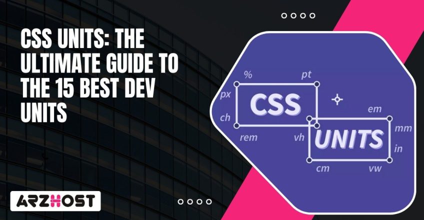
CSS unit is the number that informs the browser on the size of something on a page, whether it The browser reads that number, renders it in pixels or proportionate amounts, and constructs the layout based on that number.
As an example, font-size: 16px is the CSS unit which is the px. Substitute that with “em” or vw and the same element may either expand, contract or lengthen based on context. The language that the browser measures space with is known as units. Knowing them makes you foresee their behavior rather than trying by trial and error to ascertain their behavior in your design.
There are three different types of CSS units:
Absolute units instruct the browser to apply precise and physical measurements. They do not change regardless of the device or level of zoom. These are simple units, not responsive to screen variation and hence they are not as useful in flexible web layouts, but are more appropriate to print or static layouts.
Absolute units can be useful when you require constant control, such as in PDFs, print styles or screen mockup which depend on precise positioning. They are, however, inclined to yield to more flexible alternatives in the case of user-friendly web development.
The most commonly known unit in CSS is the pixels. They measure size in terms of the smallest dot size that can be seen on a screen. They are used by designers when precision is required such as defining border widths or icons sizes. The thing is that not every screen displays pixels in an equal manner. High pixel density devices such as retina displays squeeze more pixels in the same area, thus what appears to be just fine on one display may appear to be smaller on another.
A point equals 1/72 of an inch. It is based on print design where physical measurements are consistent irrespective of the medium. CSS points continue to be used, though that is hardly seen in responsive design as the browsers treat them differently according to the resolution. They work more with print oriented stylesheets with dimensions that must align with paper layouts.
A pica is equivalent to twelve points. This is also measured using traditional print typography where it was used to determine column widths and margins. In a current web code you will hardly ever see it because screens do not require the detail that a print layout does.
CSS uses inches in specifying physical measurement. The pixels per inch of a normal browser are 96 pixels. It will also be used primarily in print forms or in specifying media queries through physical paper dimensions. In the case of the screens, it is too stiff and fails to adapt to differences in the devices.
A centimeter is a conversion of a physical image into pixels depending on the DPI (number of dots per inch) of the device used. Due to the difference in screen resolution, this conversion does not work everywhere. It displays well in print but may cause random outcomes on the digital screens.
One centimeter consists of ten millimeters. Similar to cm and in, it is based on physical size and this restricts its use in digital screens. You may find it applied in special cases, but in the majority of cases, it remains at the background of most developers.
Experience Power with ARZ Host’s Virtual Private Servers – Free Setup with the server.
Relative units change themselves, depending on context. They do not have a fixed size, but change in accordance with the element that they are attached to. This has rendered them the workhorse of dynamic web design and friendly interfaces where spaces, text and layout all are automatically scaled to suit various screens and user preferences.
Relative units provide flexibility with no additional math. They honor the choices of the users, react to the screen alterations, and scale designs without any issues. When you begin to think relative, you write less code and render layouts that are more natural to all devices.
The em values are conditional on the parent element font size. With a parent font size of 16px, the child will be having a font size of 16px. It can be used to maintain proportions of spacing and text in a component. The awkward part is associated with the process of nesting where several values of em accumulate. e.g. when a container has 1.2em, and the child uses 1.2em again, the child increases in size which is bigger than what you might have intended.
rem stands for “root em.” It resembles em, but there is always a reference to the root element- which is usually the html tag. This renders it more predictable in the sense that everything is scaled out of a single consistent basis. It is common practice that the root font size is established as 10px or 62.5 percent (equivalent to 10px on most browsers) by developers and then typography and spacing throughout the site is calculated using rem. What is left is a cleaner math and standard scaling.
Percentage values vary with respect to the parent container. They are often applied to layout width, padding or positioning. E.g. width: 50% is a component that will take 50 percent of the width of the parent element without considering the dimensions of the screen.. This allows layouts to stretch or shrink without breakpoints.
The ex unit is calculated on the x-height of a font which is approximately the height of a lower case x. It is less of a layout and more of a typographic measure. You could apply it when you require the accurate vertical spacing to be in accordance with the letterforms themselves. Practically, it is not applied very frequently, primarily due to the fact that the x-heights of fonts can be quite different.
The ch unit is the width of the “0” character of the font that has been selected. Surprisingly, it works well with text-based elements. As an example, by setting the input field to 20ch, one can be certain that the field will remain broad enough with approximately twenty characters. That maintains UI elements across a consistent visual appearance regardless of moving to a different font.
CSS Grid uses the fr unit. It subdivides its space into parts, and enables you to build flexible grid structures with no percentages or media queries. The example of grid-template-columns: 1fr 2fr is two columns, one of which is two times as large as the other. It is simple, fast and one of the biggest reasons why Grid has become the successor to the older layout hacks such as floats and tables.
Viewport units are used to bind layout sizing to the browser window. They respond immediately when a user is resizing the screen or changing the device. It is what makes them strong when it comes to responsive design, but also difficult when you do not test across viewports. In each unit, it occupies a percentage of the visible portion of the browser, and therefore, the content adjuts without media queries or complicated calculations, which is best for Structured SEO.
The modern layouts are given their flexibility by viewport units. They are real time responsive, so content is not at a fixed size but rather adapts to the size of the user screen. They have a positive effect when utilized wisely, as they minimize the necessity of breakpoints and make designs more natural on all devices.
1vw is one percent of the width of the viewport. It is used by designers in full-width designs, horizontal spacing, or text which expands with the browser window. An example is font-size: 3vw to increase or decrease the text depending on the size of the window. It is scalable, although excessively scaling it results in readability issues, so it is better to scale it in moderation.
1vh is one percent of the viewport height. It is commonly applied to the full-screen elements, banners, or the modals that take up the available space. One of the popular patterns is height: 100vh and an element that is this tall fits to the exact height of the browser window. In mobile devices, however, dynamic toolbars may change the viewport height, and it is essential to test on actual screens.
1vmin is one percent of the smaller dimension of the viewport, whether width or height. It maintains the balance of elements with the screen rotating or varying its shape. As an example, a square with width: 50vmin and height: 50vmin will always remain in the same proportions, no matter what direction it is facing.
1vmax is one percent of the larger side of the viewport. You can use it when you wish that the elements should be expanded in regard to the largest measure of the screen. As an example, a background of 100vmax is fully covered, including ultra-wide or tall screens.
Every CSS unit has its moment. The trick is in understanding which one suits the job so that you are not struggling with your layout later. The absolute, relative, and viewport units are all used to different ends and a combination of these in a well-thought manner is likely to yield the best of outcomes.
| Unit Type | Best For | Pros | Cons |
| Absolute | Print layouts, static components | Exact sizing, reliable for fixed designs | Not responsive, ignores user zoom |
| Relative | Typography, spacing, flexible grids | Scales with context, improves accessibility | Can be unpredictable if nested |
| Viewport | Full-screen or customizable design. | Responds to screen size, no media queries needed | Needs testing on mobile browsers |
There are different types of units that solve different problems. When you have learnt how they interact, then you can just mix them without fear of which one may work. That is what makes your CSS tidy and your layouts consistent across all the devices.
Start Your Online Journey with ARZ Host! Get Fast, Secure, and Scalable Hosting.
The familiarity with CSS units alters your construction process. Rather than struggling with layouts that move and split, you begin to observe the effect of every value on the movement of a page. The correct measurement provides you with the ability to control proportion, spacing and responsiveness without additional workarounds.
Indicatively, after you grasp the way the relative units scale or the way the viewport units respond to screen size, you can create layouts that are always together regardless of where they are watched. It is such consistency that distinguishes fast styling and well-built design.
Continue testing the behavior of the various units in your projects. Browse DevTools, modify values, and observe. Little experiments are educational rather than definition learning. In time you will develop a sense of when to resort to pixels and when to rely on rem, and when to leave vw to scale the image. That is when your CSS begins working with you and not against you.
Don’t Wait, Migrate! Choose the Ideal Hosting Home for Your Site: ARZ Host.
Rem is the most popular with most developers since it scales well with root font size. It is easy to resize text between breakpoints, without having to reset values. On smaller modifications within components, em is still preferred, whereas rem allows things to remain consistent throughout the layout.
That occurs in the case of stacking em units. The font size of each nested element is inherited by its parent, which makes the math compound soon. Base sizing is best done using rem, and small, local adjustments such as padding buttons or spacing icons should be done with reserve em.
Pixels are alright with borders, icons, or accurate alignment. The issue manifests itself when accessibility or scaling comes into the play. Fixed pixel values do not take into account the user preferences and zoom levels. To have layouts that scale well, change to relative or viewport units.
vw is attached to the viewport, whereas the % relies on the parent. vw will change instantly if you resize the browser, whilst the % changes only when the parent changes. That is why vw is more suitable to full-width elements, and percent is more suitable to flexible containers.
Unless stated otherwise, units such as vh and vw are proportional to the size of the browser. That is ideal in hero sections, modals, or landing pages which do not require additional math. All you need to do is be mindful of mobile browser quirks, as address bars may interfere with height calculations.
Absolutely. Their combinations are seen in most real-world designs. As an example, you could utilize rem in text, % in containers, and vw in hero images. The trick is to know what every single unit reacts to. When you are aware of that, combining them becomes a conscious design decision rather than a trial and error.
Latest posts:

230 Ave, New York NY, 10001, United States