

Why do some advertising agency websites stand out while others look almost identical? Finding fresh design ideas can feel frustrating when every website follows similar trends. Copying flashy layouts without understanding their purpose can leave your website confusing and ineffective.
The top ad agency websites show how creativity and usability work together. They combine strong branding, engaging portfolios, and simple navigation to attract potential clients. Studying these examples helps agency owners, marketers, and designers make smarter design choices.
This article explores 15 top ad agency websites to inspire you in 2026. You’ll discover standout designs, useful features, and what makes each website unique. We’ll also compare examples, highlight common mistakes, and share practical ideas for your website.
15 Best Advertising Agency Websites to Inspire Your Brand
The best advertising agency websites combine distinctive branding, useful navigation, and clear examples of creative work. Our 15 selections cover advertising agencies, performance marketers, branding consultancies, and digital design studios. Each offers a different approach to communicating expertise and presenting projects.
These examples were selected for 5 editorial criteria: visual identity, portfolio presentation, navigation, clear messaging, and practical design inspiration. The descriptions consider observable website content and documented design features. This is an editorial collection, not a ranking based on independently measured traffic or conversion rates.
1. HigherVisibility Best for Clean Design and Clear CTAs
HigherVisibility demonstrates how clean website design can support clear digital marketing communication. Its homepage organizes services, including SEO, website design, and AI search optimization, into accessible sections. Structured navigation helps visitors identify relevant services without searching through complicated menus.

The agency combines straightforward messaging with credibility focused content and contact opportunities. This approach emphasizes what the agency provides rather than relying on elaborate visual effects. Key takeaway: Use clear service descriptions, readable layouts, and visible CTAs to guide potential clients.
2. Disruptive Advertising Best for Conversion Focused Design
Disruptive Advertising uses bold messaging to communicate its focus on measurable marketing results. Its website presents services such as paid search, paid social, conversion optimization, and data analytics. High contrast design and prominent messaging establish a direct connection between services and business goals.
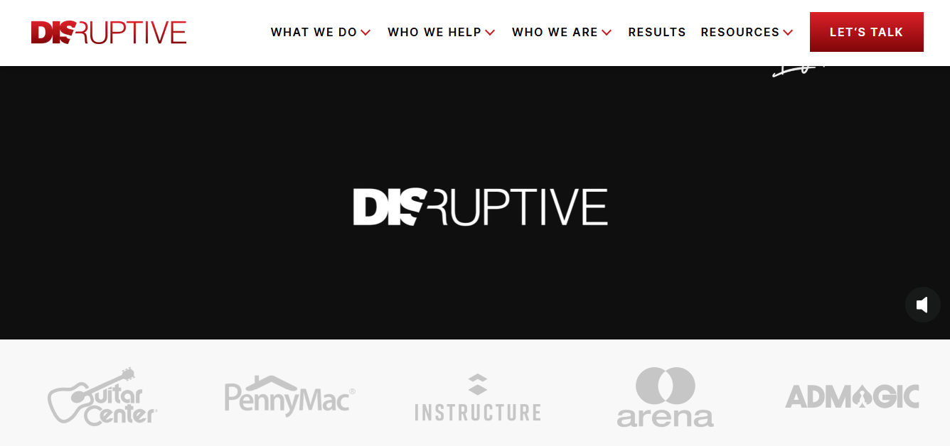
The website also highlights its approach to advertising accountability and campaign performance. Credibility messaging and consultation pathways help visitors evaluate the agency before making contact. Key takeaway: Explain your value clearly and support your claims with relevant evidence and an obvious next step.
3. Dogstudio Best for Interactive Storytelling
Dogstudio demonstrates how animation and cinematic presentation can support digital storytelling. Its website showcases creative work through animated project previews, a studio showreel, and immersive visual experiences. Motion and interactive transitions help communicate the studio’s digital production capabilities.

The site also provides access to project cases, studio information, and contact details. Its immersive approach requires particular attention to loading performance, keyboard navigation, and reduced motion accessibility. Key takeaway: Use animation to demonstrate creativity, but ensure visitors can still navigate and understand the website.
4. DDB Best for Creative Brand Messaging
DDB has been recognized for emotion led advertising and its emphasis on creative brand connections. Its previously documented website used editorial style layouts and prominent messaging to communicate that positioning. These elements provide inspiration for agencies developing a distinctive creative identity.

However, the DDB domain currently redirects to TBWA, so its earlier website presentation should be treated as a historical example. The redirect means readers cannot currently evaluate the former DDB homepage through that address. Key takeaway: Build a recognizable brand message, and verify that your portfolio links remain current and accessible.
5. Gitwit Best for Visual Case Studies
Gitwit uses project imagery and concise messaging to present its venture studio expertise. Its homepage introduces the company with the message “Building great companies. On repeat.” Project visuals and company information support its positioning around research driven business development.

The website gives visitors access to portfoli related content and information about its ventures. Visual presentation helps communicate project identity without relying entirely on lengthy descriptions. Key takeaway: Pair strong project imagery with clear context explaining what the work represents.
6. Graphite Best for Modern, Data-Driven Design
Graphite presents itself as a research-driven growth agency focused on search and performance marketing. Its website features AI related messaging alongside services such as SEO and answer engine optimization. The navigation separates research, services, case studies, and contact options.

Performance focused content connects the agency’s expertise with measurable business goals. Its data-oriented presentation provides an alternative to purely visual creative portfolios. Key takeaway: Make complex marketing services understandable through clear messaging, relevant research, and documented client outcomes.
7. Widehue Best for Video and Interactive Experiences
Widehue has been featured for using video led storytelling and interactive website elements. Webflow’s agency website collection describes a full-screen project video and hover triggered content previews. These features introduce creative work before visitors read detailed project descriptions.

Its documented design also includes portfolio presentations, client testimonials, and contact prompts. Interactive features can encourage exploration, but essential content should remain usable without hovering. Key takeaway: Present creative work through engaging visuals while maintaining clear navigation and accessible alternatives.
8. Pentagram Best for Minimalist Portfolio Design
Pentagram uses a portfolio focused website to showcase its multidisciplinary design work. Its interface emphasizes project imagery and direct access to the firm’s work archive. Clear navigation separates the portfolio from information about the consultancy and its activities.

The website demonstrates how consistent organization can support varied creative projects. Visitors can explore different design disciplines without requiring every project to share the same visual identity. Key takeaway: Use simple navigation and strong imagery to make a diverse portfolio easier to explore.
9. Wieden+Kennedy Best for Creative Campaign Presentation
Wieden+Kennedy places advertising campaigns at the center of its website experience. Its portfolio showcases work for brands such as Nike, LEGO, and McDonald’s. The navigation separates creative work, agency information, careers, and contact details.
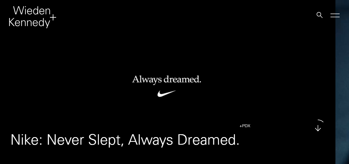
Campaign examples allow visitors to understand the agency through completed creative projects. This approach provides evidence of advertising capabilities without depending entirely on promotional service descriptions. Key takeaway: Give your strongest campaigns a prominent position and explain the creative thinking behind them.
10. KlientBoost Best for Lead Generation
KlientBoost communicates its performance marketing focus through direct, results oriented messaging. Its homepage includes a prominent offer for a free marketing plan. Navigation also highlights services, pricing, results, and the agency’s expertise.
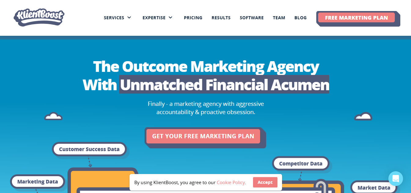
This structure gives potential clients several ways to evaluate its offering before enquiring. The website connects service information with a clearly defined next step. Key takeaway: Match prominent calls to action with the audience’s needs and provide supporting evidence nearby.
11. Doner Best for Bold Creative Branding
Doner is a creative advertising agency whose website has been recognized for cinematic presentation. DesignRush describes its use of hero video, animated case studies, and carefully designed transitions. These elements connect the website’s visual presentation with the agency’s creative advertising work.
Campaign focused visuals demonstrate how motion can introduce an agency’s style and capabilities. However, animation should remain understandable and should not interfere with loading or accessibility. Key takeaway: Use video and transitions to communicate your creative approach rather than adding decorative movement.
12. Made by Many Best for Digital Storytelling
Made by Many presents digital innovation through clear messaging and project-focused storytelling. Its homepage introduces its approach with the statement “Stop talking about it.” The supporting content connects this message with enterprise innovation and digital product development.
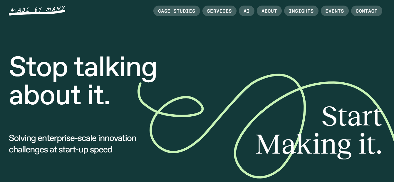
Its case studies include work associated with the World Economic Forum, Nando’s, and Multiverse. This gives visitors concrete examples of the consultancy’s capabilities across different organizations. Key takeaway: Explain your approach briefly, then reinforce it with recognizable projects and clear descriptions.
13. RNO1 Best for Modern Brand Identity
RNO1 combines branding, user experience, and digital growth services under one visual identity. Its website uses brand focused messaging to communicate expertise across digital experiences. Dedicated navigation for services, work, and company information helps organize the content.

The portfolio supports the agency’s positioning around modern branding and digital execution. Its website also connects design decisions with broader business objectives. Key takeaway: Maintain consistent visual identity while explaining how your services contribute to client goals.
14. KOTA Best for Creative Web Design
KOTA combines branding, website development, and growth marketing within a creative agency website. Its homepage communicates its positioning as a global branding and web design studio. Navigation separates work, agency information, individual services, and contact options.

Prominent project-starting links make the enquiry process visible without requiring extensive searching. This structure supports visitors who want either design inspiration or detailed service information. Key takeaway: Combine creative presentation with clearly organized services and accessible enquiry options.
15. COLLINS Best for Distinctive Visual Identity
COLLINS emphasizes brand transformation through direct messaging and a distinctive visual presentation. Its homepage introduces the agency with the statement “Rewrite your worth.” The website connects this positioning with brand related programs and supporting recognition.
Its content explains services such as brand refreshes, repositioning, and expansion. These categories help potential clients understand the business purpose behind its branding expertise. Key takeaway: Develop a memorable brand proposition and connect it to specific services and examples of work.
Comparison of the Top Advertising Agency Websites
The 15 advertising agency websites differ in specialization, portfolio presentation, and their approach to visitor engagement. Some prioritize creative storytelling, while others focus on measurable business outcomes. This comparison helps identify relevant design inspiration for different website goals.
| Agency | Specialization | Standout Feature | Best Inspiration For |
| HigherVisibility | Digital marketing | Clear service navigation | Simple website structure |
| Disruptive Advertising | Performance marketing | Results-focused messaging | Conversion-oriented design |
| Dogstudio | Digital production | Immersive animation | Interactive storytelling |
| DDB | Creative advertising | Historical emotion-led presentation | Brand messaging |
| Gitwit | Venture development | Image-led project content | Visual portfolio presentation |
| Graphite | Growth marketing | Research-focused messaging | Data-driven communication |
| Widehue | Creative design | Video and hover interactions | Visual storytelling |
| Pentagram | Brand design | Organized portfolio | Minimalist navigation |
| Wieden+Kennedy | Creative advertising | Campaign showcases | Advertising portfolios |
| KlientBoost | Performance marketing | Prominent marketing offer | Lead generation |
| Doner | Creative advertising | Cinematic motion | Campaign presentation |
| Made by Many | Digital innovation | Project storytelling | Case study structure |
| RNO1 | Branding and UX | Consistent positioning | Modern brand identity |
| KOTA | Web design | Service and project navigation | Creative web development |
| COLLINS | Brand transformation | Direct brand messaging | Distinctive positioning |
For interactive design inspiration, compare Dogstudio’s immersive presentation with Pentagram’s simpler portfolio approach. For lead-generation ideas, examine the service messaging of HigherVisibility and KlientBoost. The right reference depends on your audience, business goals, and available resources.
What Makes a Great Advertising Agency Website?
A great advertising agency website combines 4 essential qualities: clear branding, easy navigation, credible project evidence, and visible calls to action. Each quality supports a different stage of the visitor experience. Together, they help potential clients understand the agency and decide whether to make contact.
Clear Branding and Visual Identity
Strong branding communicates what an agency does and what makes its approach distinctive. Typography, imagery, and color should support the same recognizable identity. DDB’s historical emotional positioning and COLLINS’ direct brand messaging demonstrate 2 different approaches.
Easy Navigation and Mobile Friendly Design
Effective navigation makes services, portfolio work, and contact information easy to locate. Use descriptive menu labels and ensure layouts work on mobile devices. Test website performance using tools such as Google PageSpeed Insights and Lighthouse.
Google recommends a Largest Contentful Paint of 2.5 seconds or less at the 75th percentile of page visits. This measures how quickly the largest visible content element appears.
Strong Portfolios and Client Case Studies
A useful portfolio explains the challenge, solution, and outcome behind each project. Wieden+Kennedy demonstrates campaign focused presentation, while Made by Many organizes work around digital projects. Include measurable results when the client has authorized their publication.
Trust Signals and Clear Calls to Action
Trust signals help visitors evaluate agency credibility before making contact. Examples include verified testimonials, client references, and documented campaign outcomes. Pair these with clear actions such as “View Our Work” or “Request a Consultation.”
Creative Design Trends in Advertising Agency Websites for 2026
Four notable design approaches in 2026 include minimalist layouts, interactive motion, video storytelling, and data driven presentation. Each serves a different communication purpose. The most suitable approach depends on the agency’s services and audience.
Minimalist layouts and bold typography emphasize information hierarchy and readable messaging. Pentagram demonstrates how prominent project imagery can support a straightforward portfolio. Clear spacing also helps separate content without requiring decorative elements.
Interactive animations and video storytelling make creative work visible through movement. Dogstudio demonstrates immersive interaction, while Widehue has been documented using video led project presentations. Motion should support the message without obstructing navigation.
AI related messaging and data visualization are relevant to performance focused agencies. Graphite connects research, SEO, and AI search services with growth oriented communication. Relevant charts should include enough context to explain what the numbers represent.
Common Advertising Agency Website Design Mistakes
Five avoidable mistakes can weaken an advertising agency website: excessive animation, confusing navigation, poor mobile usability, weak portfolios, and hidden contact options. These problems can make it harder for visitors to understand the agency. Each requires a different practical solution.
1. Overusing animation: Unnecessary movement can distract visitors from important content. Avoid excessive autoplay video, repeated transitions, and effects that block interaction. Provide reduced motion alternatives where possible.
2. Complicated navigation: Unclear labels can make important pages difficult to locate. Use familiar categories such as Services, Work, About, and Contact. Ensure menus remain usable with keyboards and touchscreens.
3. Ignoring mobile usability: Poor spacing, tiny buttons, and slow loading images create unnecessary barriers. Test website layouts at different screen sizes before publication. Check performance using both laboratory tests and available real user data.
4. Weak portfolios: Attractive imagery alone does not explain the value of a campaign. Include the client’s challenge, the agency’s solution, and available outcomes. Avoid unsupported claims about revenue growth or campaign success.
5. Hidden contact information: Visitors should not need to search extensively to request a consultation. Display relevant contact links near service descriptions and portfolio content. Keep enquiry forms understandable and request only necessary information.
What Can You Learn From the Best Ad Agency Websites?
The strongest lessons from these 15 websites involve brand consistency, accessible portfolios, purposeful design, credible evidence, and clear visitor journeys. These principles apply to both established agencies and smaller creative businesses. They can guide a redesign without requiring expensive effects or complex development.
Match your design to your brand identity. Study how COLLINS communicates its positioning and how RNO1 presents branding expertise. Choose a visual style that reinforces your actual services instead of copying unrelated trends.
Make creative work easy to explore. Organize projects by relevant categories, such as advertising campaigns, brand identity, or digital experiences. Use descriptions that explain what the agency delivered and why it mattered.
Balance creativity with usability. Dogstudio demonstrates advanced visual interaction, while Pentagram illustrates a simpler portfolio approach. Evaluate each design choice against navigation, readability, accessibility, and performance.
Build trust and guide the next step. Use documented outcomes, client testimonials, and clear contact options where appropriate. HigherVisibility and KlientBoost provide useful references for direct service communication and prominent enquiry opportunities.
Frequently Asked Questions
What are the best advertising agency websites in 2026?
The best examples depend on the type of design inspiration you need. Dogstudio is relevant for interactive storytelling, while Pentagram offers portfolio organization ideas. HigherVisibility and KlientBoost provide examples of clear service communication and conversion-oriented messaging.
What makes an advertising agency website stand out?
A distinctive website combines recognizable branding, useful content, and straightforward navigation. Its portfolio should demonstrate creative capabilities through real projects. Trust signals and visible contact options help visitors understand the agency’s expertise.
Where can I find creative agency website inspiration?
Start with the official websites of creative agencies such as Pentagram, Wieden+Kennedy, and Dogstudio. Design galleries such as Awwwards also provide curated examples. Compare layout, messaging, portfolio structure, and usability before adapting an idea.
What should an advertising agency website include?
An agency website should include clear service descriptions, a portfolio, company information, and contact options. Case studies should explain completed work and documented outcomes. Mobile usability, accessible navigation, and reliable loading performance are also important.
How do top advertising agencies showcase their work online?
Leading agencies present work through campaign pages, project imagery, videos, and case studies. Wieden+Kennedy uses advertising campaign examples, while Made by Many presents digital product projects. Effective presentations connect creative execution with the original project objective.
Conclusion
The top ad agency websites in 2026 demonstrate how creative presentation can support clear communication and business credibility. Examples such as Dogstudio, Pentagram, and KlientBoost show different approaches to storytelling, portfolio design, and visitor engagement. The most useful inspiration comes from understanding each website’s purpose rather than copying its appearance.
When planning your own website, focus on consistent branding, relevant work examples, and straightforward navigation. Support creative choices with accessible design and credible project evidence. The goal is a website that reflects your agency’s strengths and helps visitors take the next step.